
Why I Redesigned My Game's Heat Meter From Scratch
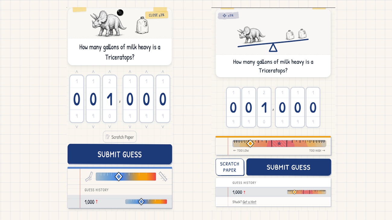
For a long time, the heat meter in Strange Measures worked like a standard hot-or-cold bar. You typed in a guess, and the meter filled up from left to right. Cold and blue on the far left meant you were way off; hot and red on the right meant you were getting close. It made sense on paper, but in practice, it created a constant point of friction.
The "What & Why"
The biggest issue with the old setup was that it only answered half of the player's question. You would land on "warm" and still have no idea if your guess was too high or too low. You were forced to look in two different places to give the full feedback needed to guess again. On top of that, the stark blue and bright red colors stuck out like a sore thumb against the rest of the game. Strange Measures uses a hand-drawn, field-notebook visual identity with cream paper and dark ink. The rainbow colors felt out of place.
The Struggle
The challenge was adding directional hints without turning the game into a brainless "higher or lower" bot. The magic of Strange Measures comes from the satisfaction of reasoning out absurd real-world comparisons. If the UI gives away too much, the mental math disappears. I wanted to show without telling.
The Solution & Insights
I threw out the left-to-right bar entirely and moved the target to the dead center. Here is how the refactored meter works now:
- Center Target: Perfect sits right in the middle, marked with a star.
- Left vs. Right: Guess too low and your diamond marker lands on the left side. Guess too high and it lands on the right.
- Folded Heat Palette: I removed the harsh blues. Now, cold guesses are desaturated, and the colors warm up into saturated tans, yellows, oranges, and reds as you get closer to center, regardless of which side you are on. This keeps the visual feedback strong while staying true to the notebook palette.
- Dynamic Win Windows: A dashed bracket now surrounds the center star to mark the exact win condition. Pick Exact difficulty and that bracket hugs the star tight. Pick Approximate and it opens wide. You always know the exact tolerance you are aiming for.
- Clutter Reduction: I stripped out the old cold-face and fire-face icons on the sides. Instead, a new win-spin animation triggers on the center star when you hit the target.
Key Takeaway: Good game UI should reduce unnecessary hesitation, not the core challenge itself. Telling players which direction they missed does not solve the estimation for them, but it stops them from wasting time guessing blind.
Community Questions
- Do you agree with the change? Is this a step forward for clarity, or did I introduce new problems?
- How do you handle proximity feedback in your own projects? Do you prefer explicit directional indicators, or do you like making players figure out the trajectory on their own?
Discussion